I went out to try to brush the dust off my R skills and with it, the old blog. I figured I’d try something straightforward to start with – the price of milk. Well, turns out, even milk isn’t that simple.
The USDA publishes a nice dataset called the food environment atlas that contains a lot of fun stuff. Things like grocery store locations, farmers market locations, some basic socioeconomic data, and, of course, three separate measures of berry farming in a given county. Just, I suppose, in case.
So I figured I’d look into what appears to influence the price of milk. I thought I’d start with the freebie – median household income in an area. I figured, you know, that things would be more expensive where people had more money. Yeah, yeah, I know there are examples of where being poor prevents you from achieving savings available to rich people, but come on, higher incomes, higher rents, more willingness to pay higher prices, fancier stores, etc. So like I said. I figured it’d be a freebie, and every sentence I wrote in this post would start with “controlling for median household income”.
Yeah, so then this happened.
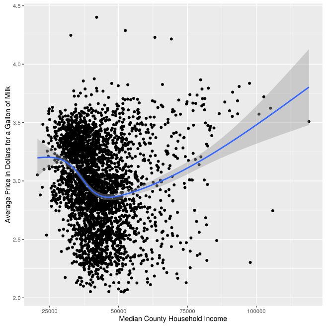
A freaking weird shaped graph. I mean OK, so above incomes of 50k or so, the thing makes sense. But what the heck is going on below that? Why does milk cost about 50 cents a gallon more in counties with median incomes of $25,000 than counties with median incomes of $50,000. My first inclination was to just arbitrarily remove low income counties from the data-set and figure nobody would notice, and move on to write the post that I wanted to write. But then I realized nobody’s paying me to do this and this is getting published regardless of whether I get nice, clean results so there’s no need to fudge my data to get the results I want. But a note to any potential future employers reading this: Don’t worry, I can fudge with the best of them.
Anyway, so what the heck is going on here? My first thought was that maybe I was misinterpreting the graph. Nope. Milk really is the cheapest in counties with median incomes around that 50k mark, and counties with median incomes of about 30k have about the the same prices as counties with median incomes of about 80k.
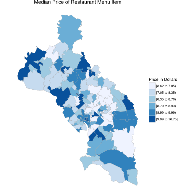
Well, the nice thing about having data at the county level is that you can make pretty maps. So I made some (I mean it also is helpful to interpret the data and all that boring stuff).
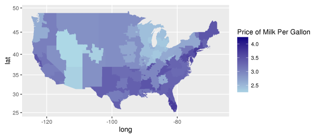 So there I was, just trying to make a pretty map and there’s actually some information in there. Kind of a pain, but now I have to talk about it. Anyway, milk is cheaper in the Midwest and out in the mountains/deserts. Pretty expensive on the coasts, especially the east coast, and most of the south.
I need to make a quick digression here to fulfill a standard requirement of all U.S. data journalism with a geographic component: a ranking or map that shows the deep south is struggling. So here’s a map that shows how many gallons of milk you could buy with the median household income in each county.
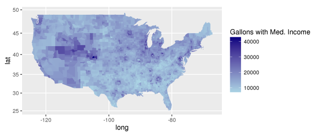
The Midwest and Rockies could just swim in milk. They’re not doing quite as well in terms of income as the coasts, but they low price of milk more than makes up for it. The coasts do alright, at least the metropolitan areas, presumably because they have high incomes, but the south and other rural bits and pieces are pretty milk-poor.
Back to the main point. From the first graph, it seems like milk prices are fairly consistent within a given region of the country. And for what it’s worth, low price regionsdo tend to be in the middle of the income range – i.e. not as wealthy as the coasts, but not as poor as the south. So at least that makes sense. But why should milk be cheaper in those regions?
Some of you might have figured out where I’m going with this. Milk is cheap close to where it’s produced. Makes sense, since it’s perishable and therefore fairly pricey to transport. Here’s a map of milk production in the U.S. that has some pretty darn strong parallels to the milk price map (and not just because I have a bit of a thing about maps, I promise).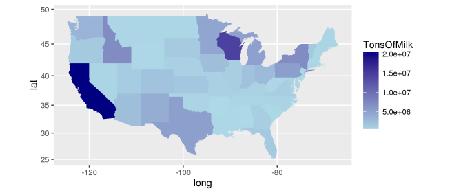
And if you’re more of a scatterplot person, here’s a scatterplot showing that milk price and milk production are negatively correlated.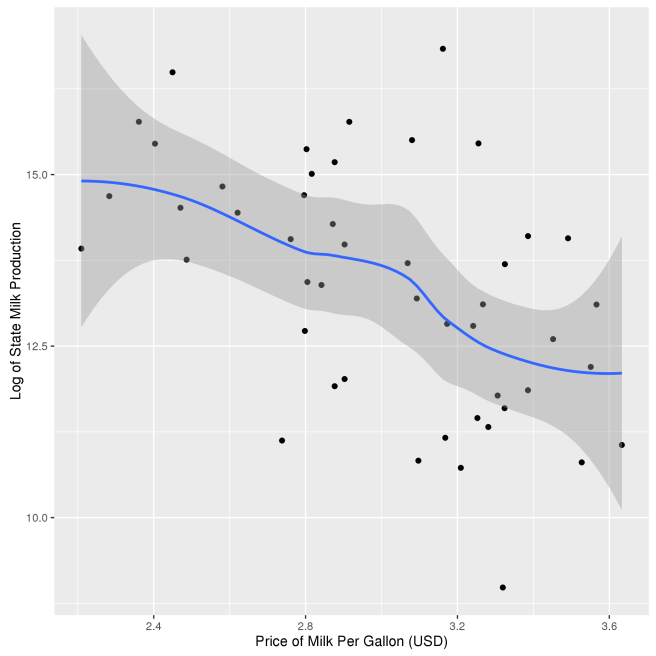
Finally, here’s a scatterplot showing that milk production is highest in middle income states. 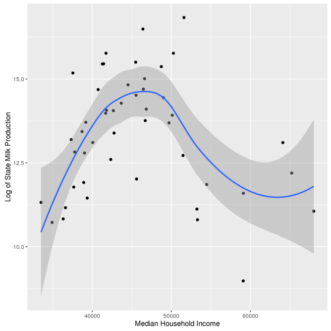
So where does that leave us? Well, there seems to be a cluster of three related variables – low milk prices, high milk production regions, and middle income counties or states. Of those, the causal link from milk production to milk prices seems to be the most reasonable. However, even when you control for milk production, middle income states still have the lowest prices (the effect is reduced by about 1/2).
We’re left with some questions and some answers. First, the cleanest conclusion is that milk prices are lowest in milk producing regions. Second, milk prices tend to be lowest in middle income areas, partly, but not entirely, because middle income areas tend to produce milk. Third, it stinks to be poor where prices are high, and prices aren’t necessarily high only in areas with high incomes or real estate values.
But I’m still left with some questions. What’s causing the part of the income effect on price that isn’t attributable to milk prices? Is it coincidence? Something to do with the costs of operating retail establishments in low income areas? I don’t know. Why do middle income regions tend to produce milk? Is agriculture tied to middle income? Is it a coincidence? I don’t know. And here again, I have the last laugh. Because I’m just going to click publish even though I don’t have satisfying answers to all the questions and nobody can stop me. I’m not even going to make something up so that we can all sleep better at night. So there.